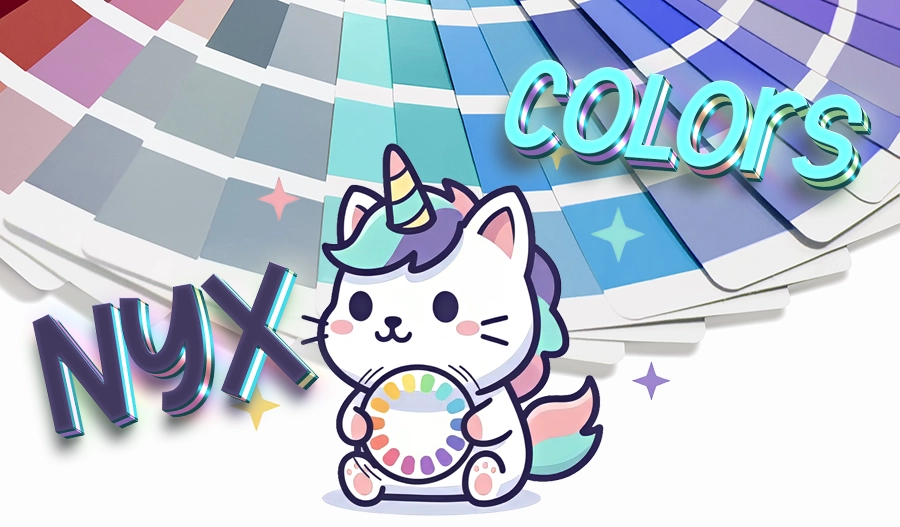

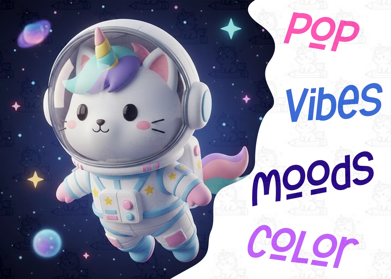
Color is the quickest way to communicate a feeling—and I love using it to build entire worlds. Here’s how I approach color and mood when designing my art.
Start With a Vibe
Before I draw anything, I choose an overall theme: dreamy, neon, dark fantasy, celestial, soft pastel, etc. This sets the direction for the entire piece.
Build a Color Palette
I pick 3–5 main colors that match the vibe. For example:
Dreamy: lavenders + soft blues
Neon: hot pinks + electric greens
Mystical: deep purples + gold accents
Add Lighting to Match the Mood
Lighting sells the emotion—soft glow for peaceful scenes, harsh contrast for dramatic ones.
Tie Everything Together
Textures, line weight, and small details reinforce the aesthetic and make the final artwork feel cohesive.
Color is one of my favorite storytelling tools, and I’ll be sharing more palette ideas and mood boards on the blog soon.